This week, our UX researcher Eric Nouri presents a concise but efficient article! Its subject? A correct calendar display when selecting a date on responsive websites. The Studies Center, represented here by Eric, spreads good practice on the matter, following many user tests’ feedbacks.
So, how can we facilitate the date selection for the user?
Bad practice in calendar display
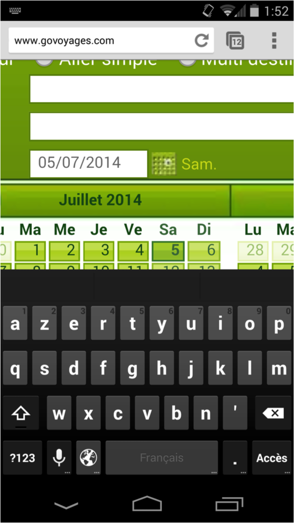
First of all, let’s talk about bad practice in terms of calendar display, here on the smartphone version of the non-responsive Govoyages website:
Making a reservation is a process that usally requires going back and forth between the form and the search results.
On touch-enabled devices, and especially on smartphones, data capture is difficult for users and the existence of numerous text fields may even discourage them. It is very important to facilitate their task (as always) with the display of a calendar to prevent mistakes on the date format for example.
However, it is not uncommon to see a text field next to a calendar. The problem here is that the date field opens the virtual keyboard (the letters keyboard instead of the numeric keypad) which hides the calendar and forces the user to scroll, at the risk of selecting the wrong box.
Good practice, recommended by our UX researcher
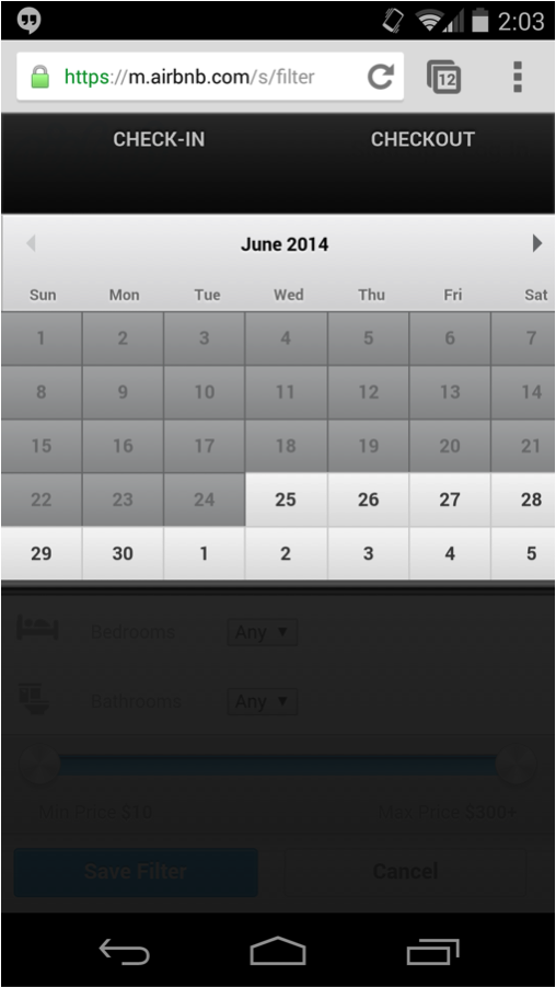
My recommendation for a correct calendar display: opening the calendar in full screen to facilitate the selection through big boxes (to prevent errors caused by big fingers) and avoid scrolling.
For a smartphone screen:

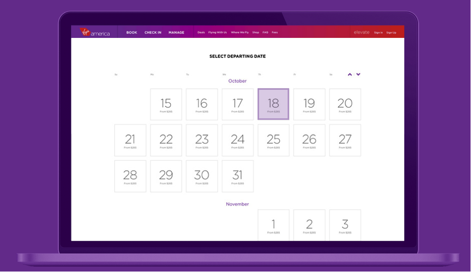
This type of full screen calendar display also works wonderfully with a mouse interaction on a computer:


